May 3, 2024
Looker Studio guide for marketers: How to build engaging and actionable dashboards
12-MINUTE READ | By Kathy Murillo & Isha Shinde
[ Updated May 3, 2024 ]
Turning data into visuals using suitable graphs and charts is a great way to monitor your campaign performance and communicate the results with different stakeholders.
In this article, we’ll show you step-by-step how to build an actionable dashboard using one of the most popular data visualization tools among marketers—Looker Studio.
Navigate this post:
- Navigating Looker Studio interface
- Understanding your data: Metrics vs. Dimensions
- How to set up a Looker Studio dashboard
- The most frequently asked questions about using Looker Studio
- Best practices for building Looker Studio dashboards
- Additional resources
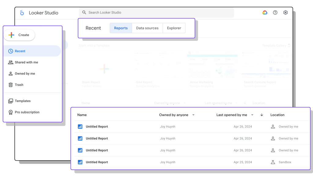
Navigating Looker Studio homepage
When you go to the Looker Studio homepage, you’ll see these options:
- Reports: You can start building your reports or the template from scratch. In this tab, you can also see all the reports created by you and other people in the team.
- Data sources: here, you’ll find a list of data sources used in all reports
- Explorer: this is a new tool that lets you visualize your data using a single chart without building a new report
You can also start by clicking ‘Create’ on the left side of the screen:
- Report: this opens a blank and a new report
- Data sources: this leads you to the connector gallery, where you’ll find over 1000 data source connectors
Looker Studio has many pre-built reporting templates that let you get started in minutes. You can also customize them so they serve your reporting needs.
Additional resources: Besides the templates available in Looker Studio’s gallery, you’ll find more options from the Supermetrics templates gallery.
Understanding your data: Dimensions vs. Metrics
Before we hand you the key to the castle—how to build a Looker Studio dashboard, it’s important to understand metrics and dimensions. They’re the building blocks of any reports, telling you interesting insights about your data:
- Metrics: These are quantifiable measures, the numbers that tell a story. For example, website traffic, conversions, or social media engagement.
- Dimensions: These are categories or attributes that add context to your metrics, such as user demographics, location, landing pages, or ad formats.
For example, your website sees a high number of purchases. To understand this better, you can add an acquisition channel dimension to see which channels bring the most traffic.
How to set up a Looker Studio report
Step 1: Connecting the right data source
Let’s start by creating a new blank report in Looker Studio.
From the left side of your screen, click ‘Create’ >> ‘Report’. You’ll see the connector gallery.
Search for and click the data source you want to pull data from. You’ll need to follow the instructions on the screen to authenticate your data source. For example, this tutorial shows you how to authenticate the Supermetrics data source connector for Looker Studio.
Once connected, Looker Studio will automatically open your report and display a sample of fields from the newly added data source.
You can use native Google connectors to bring data from Google Analytics, Google Ads, YouTube, and other Google products to Looker Studio for free.
On the other hand, you can use a third-party connector, such as Supermetrics, to pull data from other channels. Here’s how you can benefit from using Supermetrics for Looker Studio:
- Combine marketing and sales data: you can connect to data from 130+ platforms such as Facebook Ads, LinkedIn Ads, TikTok Ads, HubSpot, Mailchimp, etc.
- Find more metrics and dimensions: We focus on connector quality and try to get as many metrics and dimensions from the APIs as possible. You’ll find even more data from the Supermetrics connector than the native Google connectors. Check out our documentation page to see what data you’ll get.
- Access to Supermetrics Charts: you’ll get more options to visualize your data and elevate your data storytelling.
Step 2: Adding charts and graphs to your report
One tip for building reports in Looker Studio is to start by designing the structure of dashboards—what information you want to include, where you want to place it, and what theme and colors you want to use. Think about your audience and what information they’re most interested in.
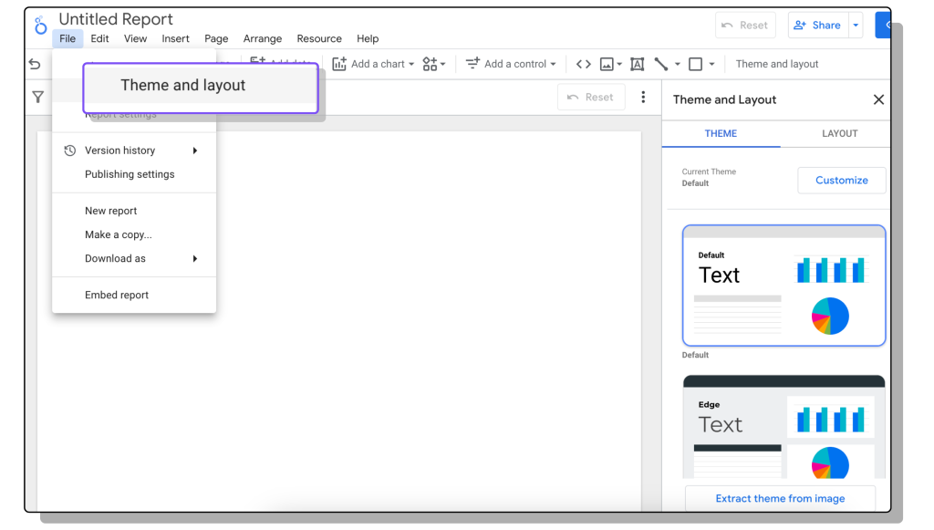
Choosing a theme
By choosing the theme beforehand, you can save time when designing your report because you won’t need to adjust the look and feel of each chart individually. You can ensure that all your charts follow a cohesive style throughout your dashboard, making it easier to focus on the data itself. Here are some options to customize your dashboard:
- Manually edit the theme: You can modify fonts, colors, chart backgrounds, etc. This lets you create a consistent and visually appealing look for your entire dashboard.
- Extract a theme from an image: You can import an image (such as your website homepage and use its color scheme to create a theme for your dashboard. This is a handy way to achieve a cohesive design if you already have a brand style guide or a specific color palette in mind.
- Pre-designed themes: Looker Studio offers a library of pre-designed themes with various color options for visualizations. These serve as a great starting point, especially for beginners.
Adding charts
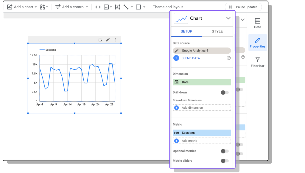
To add a chart to the report, you can go to the top menu and click ‘Add a Chart.’ This will display a list of default charts available. Choose the desired chart and click the area within the report where you want to position it.
Pro tip: When adding charts to your Looker Studio report, prioritize immediate understanding for your viewers. Each visualization should tell a clear story within 3 seconds. Tailor the level of detail and terminology to your audience. If your audience includes people who aren’t familiar with marketing terms, avoid jargon that might confuse them (like “CTR”).
For example, let’s add a time series chart with the following parameters:
- Data connector: Google Analytics 4
- Metric: Session
- Dimension: Date
- Date range: Last 30 days
Adding controls
Controls are interactive elements in Looker Studio reports that allow viewers to filter data, adjust the time frame, set parameters, and even switch between data sets. This makes reports more dynamic and lets viewers explore the data in different ways.
Here are some popular options:
- Date range: You can select a specific date range for analysis.
- Drop-down list: You can choose specific categories or segments to filter the data. For example, filtering by device type.
- Input boxes: You can enter specific values for filtering. For example, filter website traffic by a specific keyword.
- Slider: You can adjust a range value to filter data. For example, filter session duration.
In this video, we show you how to use date control to select your reporting period.
Step 3: Configuring charts
On the set-up menu, you’ll see additional options for each chart. A few useful features include:
- Drill-down allows the user with view-only permission to select the granularity of the chart. You can allow the viewers to choose between date, week, quarter, or year. If the chart is configured with date by default, the viewer can click the arrows to see the data by month instead.
- Sort the chart data by metric (ascending or descending) for easy analysis.
- Add chart-level filters.
- On some of the chart types, such as the scorecards, tables, and line charts, you can add a comparison date range to compare to the previous period or previous year.
- Add sparklines to scorecards for quick trend visualization.
This tutorial shows you different ways you can play with additional features to dive deeper into your report.
Step 4: Formatting and sharing your dashboard
Let’s do a quick check before sharing your dashboard. Make sure you:
- Add clear and concise titles to your dashboard and charts for better comprehension
- Refine the overall look and feel of your dashboard with consistent fonts, colors, and backgrounds
- Add filters strategically to allow users to focus on specific aspects of the data.
Pro tip: Click on the three dots at the upper right corner of the chart to copy it (or cmd + c | ctrl + c). Then do the same on another chart, but click Paste Special -> Paste style only. This will save you a lot of time when styling.
To get more tips on styling, watch our styling tutorial for Looker Studio styling.
To share your report, you can click the drop-down menu next to the share button at the top right corner, where you can find different sharing options for the dashboard.
You’ll find different options to share your dashboards:
- Invite viewers/collaborators: Grant access to specific people or groups, allowing them to view or edit your dashboard.
- Schedule delivery: Send automated reports in PDF format at set intervals.
- Generate a shareable link: Create a short URL for easy access to your dashboard.
- Export data: Export your data from a chart to Google Sheets or CSV.
- Embed for integration: Integrate your dashboard into a web page.
- Download and distribute: Download a PDF version of your dashboard for offline sharing.
Choose the sharing method that best suits your needs and audience. Remember, link sharing offers broader access, so use it cautiously.
Bonus: Getting more insights with data blending
You can build a simple Looker Studio dashboard with the previous steps. But if you’re reporting on multiple channels and you want to see the complete performance, data blending is a feature you should be familiar with.
Data blending means combining data from multiple sources to gain a holistic view of your performance. To start, Click ‘Resource’> ‘Manage blends’> ‘Add a blend’. Let’s say you want to monitor impressions over time across all channels. You should:
- Choose your data sources: for example, Facebook Ads and Google Ads
- Metric: impressions
- Dimension: date. This is your join key
- Click ‘Configure join’ and choose full outer join operator, then click ‘Save’.
Return to your Looker Studio dashboard and create a table with your blended source. You can then add a calculated field to sum impressions from each channel and get the total impressions from all channels.
A word of caution: while data blending in Looker Studio is a great feature allowing you to enrich your data and unlock its full potential, it also comes with some limitations that could slow your report down or affect your data accuracy. Head over to our article on the limitations of data blending in the Looker Studio to see how you can avoid these data blending headaches.
The most frequently asked questions about using Looker Studio
Looker Studio is a powerful tool, but even the most experienced users encounter challenges. Here are the most frequently asked questions we usually receive from our customers.
Why is my report running slow?
Several factors can slow down your report:
- Too much data: Looker Studio reports work best with a manageable amount of data. If you’re cramming in a lot of information, it can slow things down. Consider these fixes:
- Reduce the amount of data requested: Use fewer charts and data-intensive features like complex calculations or full outer joins.
- Use filters strategically: Break down your report into sections or use filters to display data on demand rather than loading everything simultaneously.
- Use many advanced features together: Some features, while powerful, require more processing power. If you’re using a lot of complex elements, consider using the Extract Data connector by Google to handle large datasets more efficiently. This creates a snapshot of your data that Looker Studio can work with more quickly. Read more in our article: How to make slow Looker Studio report faster with Extract Data connector.
- Lack of a storage layer: While you can pull data directly from sources to Looker Studio, this can occasionally slow down your report. The solution is adding a storage layer in between, where you can store and manipulate your data before feeding it to Looker Studio for visualization. Explore adding a storage layer like Google Sheets, Supermetrics Storage (which you can use to centralize your data like in a data warehouse but without the difficulties of owning one), or a data warehouse (e.g., BigQuery, Redshift) depending on data volumes.
I need to blend more than five data sources for my dashboard. How can I handle this?
Looker Studio natively allows the blending of up to five data sources. For complex dashboards requiring more, consider connecting to a data warehouse like BigQuery for seamless data manipulation and increased capacity.
Why is my data blend showing incorrect numbers?
Data blending can be tricky. It might be related to join types if you’re encountering unexpected results. Our data blending article offers a deep dive into this concept. A simpler alternative might be using Supermetrics data blending – this feature makes it possible to unify data from multiple Supermetrics data sources into one graph or table without requiring technical knowledge.
My calculated field is showing no data as a result, even though there is data?
Null values can cause calculated fields to display “no data.” To prevent this, use the IFNULL function to replace null values with 0. This is a best practice to avoid unexpected issues in calculated fields.
I’m unsure which chart type to use for my data. How can I choose the most effective one?
Not all charts are created equal. Pie charts can be tricky with many variables. Opt for bar charts for clear comparisons when showcasing multiple data points. You can explore resources like From Data to Viz for data visualization guidance.
What are the calculated fields I can use in Looker Studio?
Explore the comprehensive list of functions provided by Google about calculated fields.
How do I change the names of the fields to those of my language?
You can rename fields in the data source editor to your preferred language. This is most efficient at the connector level for reusability across reports. For Supermetrics connectors, leverage the report language feature for automatic translation in popular languages.
How can report viewers see the date and number formatting of the charts on their local convention?
Looker Studio respects the viewer’s Google account language for date and number formatting. To ensure a consistent format, you can add the desired language code to the report URL (e.g., “?hl=pt-br” for Brazil). This also changes the interface language for the viewer.
Best practices and tips for using Looker Studio
Here are our favorite tips to elevate your Looker Studio dashboards:
- Create calculated fields and name changes at the data source level lets you reuse those fields on different charts and reports, saving you time.
- Use the features found when right-clicking a chart. For example, order a chart, paste the style only, or make a report-level item. Additionally, if you select several items at a time, you’ll find more features, such as aligning horizontally or grouping charts.
- Use the drill-down/up option to get different views of your chart, for example, monthly, quarterly, or yearly, rather than creating separate charts for different periods. You can also add a note next to the chart to let the dashboard viewers know that they can drill down/up to get more details.
- Use grids to align your charts when designing a dashboard. To do that, choose ‘View Grid’ from the View menu at the top left corner.
You can get more tips from this article — Looker Studio (Data Studio) for marketers: 10 must-know tips.
Never stop learning
We’ll leave you with a curated list of resources to help you learn more about data visualization and Looker Studio.
General data visualization:
- Share data through the art of visualization (Coursera): While this specialization focuses on Tableau, it offers a strong foundation in data visualization principles applicable across platforms.
- Color accessibility: This article discusses color accessibility and how you can make your reports inclusive for viewers with color blindness.
- The McCandless Method for effective visualization: Learn this popular approach to crafting clear and impactful visualizations.
- Beautiful daily visualizations: Get inspired by a daily showcase of visualizations that embody the McCandless Method.
- Chart choice tool by From data to Viz: Explore this interactive tool to identify the most suitable chart type for your data (primarily geared towards R and Python users, but offers general insights).
Looker Studio specific resources:
- Looker Studio help center: Stay informed about the latest features and functionalities directly from Google’s official Looker Studio resources.
- Looker Studio calculated field references: This comprehensive reference guide will deepen your understanding of Looker Studio’s calculated field functionality.
- Supermetrics Looker Studio template gallery: Discover pre-built Looker Studio templates to jumpstart your reporting process.
- Supermetrics for Looker Studio tutorial: Learn how to build reports from scratch by following this step-by-step tutorial series, which covers everything from charts and controls to filtering, sorting, and blending.
- Supermetrics Charts: Enhance your dashboards with a collection of advanced data visualization options specifically designed for Looker Studio.
Supermetrics Sources:
- How marketers can master data storytelling and visualization with Lea Pica.
- Looker Studio (Data Studio) for marketers: 10 must-know tips.
- Data blending in Looker Studio and how to overcome its limitations.
- Improve your Looker Studio dashboards with three advanced charts from Supermetrics.
- Six ways to bring your GA4 data into Looker Studio.
About the author

Kathy Murillo
Kathy is a Marketing Analyst Consultant at Supermetrics. She’s helping thousands of Supermetrics customers get a unified view from multiple marketing data sources. She's specialized in building data warehouses and Supermetrics templates, including Looker Studio. Additionally, Kathy contributes to multiple articles about marketing analytics, measurement, and tools on the Supermetrics blog. She recently participated as a panelist in a LinkedIn-sponsored event about marketing measurement.
Isha Shinde
Isha is a Junior Demand Gen Manager at Supermetrics with a knack for blending tech and creativity. Being a computer science engineer with experience in the marketing field, she brings a unique blend of technical and creative skills to her work. From crafting compelling content to leveraging data-driven insights, Isha is passionate about making an impact through her marketing efforts.
Turn your marketing data into opportunity
We streamline your marketing data so you can focus on the insights.